burbbeauty doseoflolade
  • Home
  • About
  • Contact

Dose of Lola


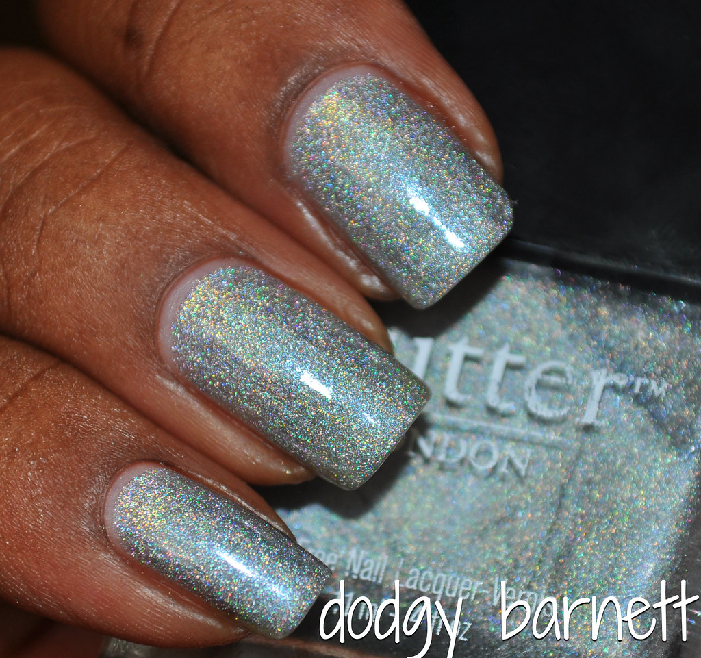
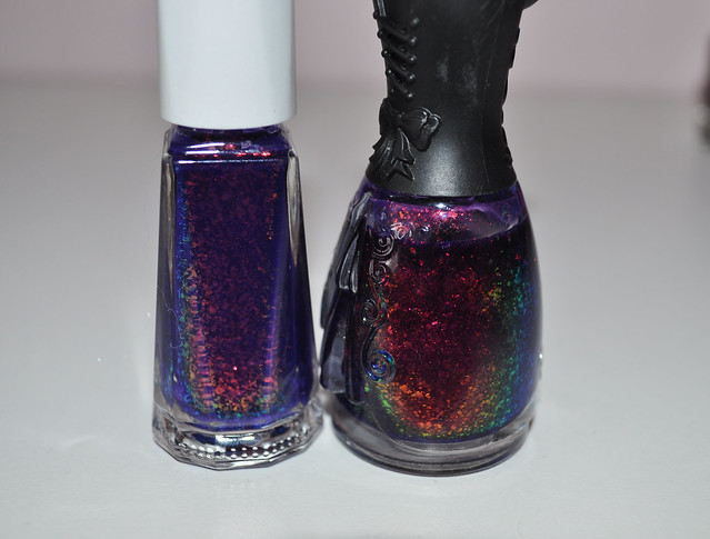
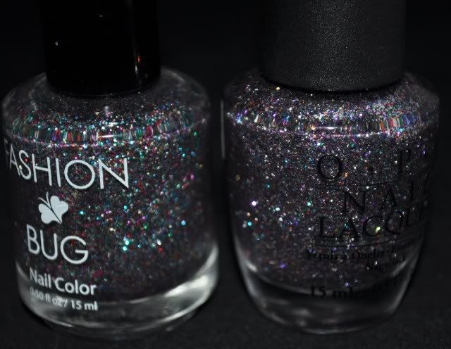
Hard Candy Emerald's Eve,  Deborah Lippmann Shake Your Money Maker


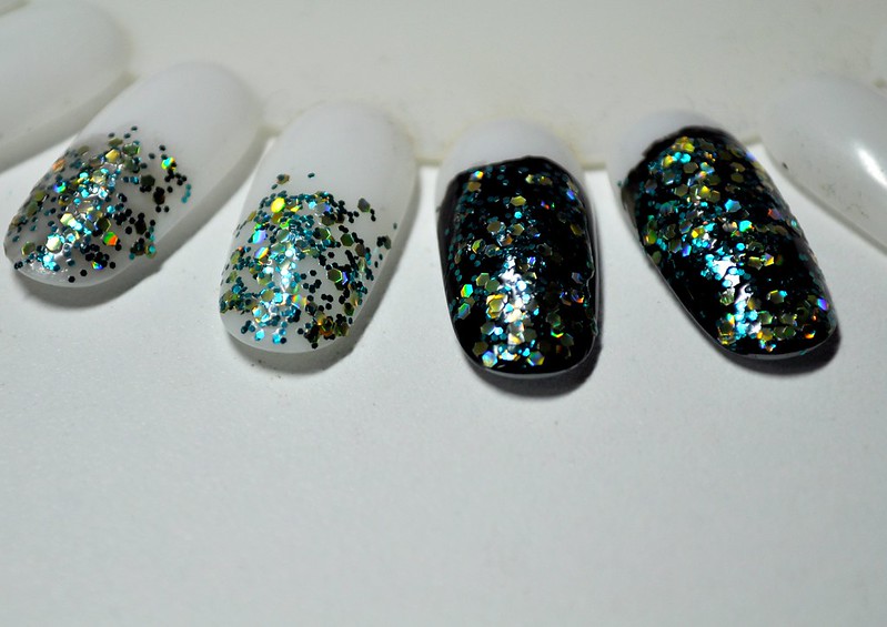
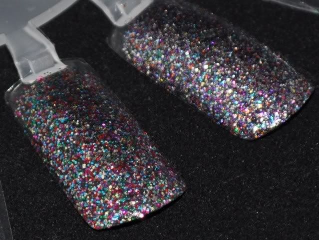
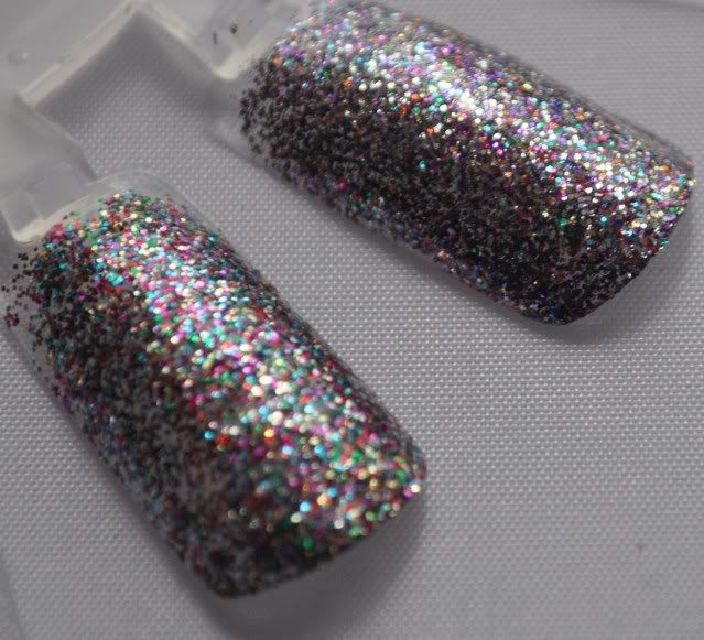
Emerald's Eve, Shake Your Money Maker Emerald's Eve, Shake Your Money Maker

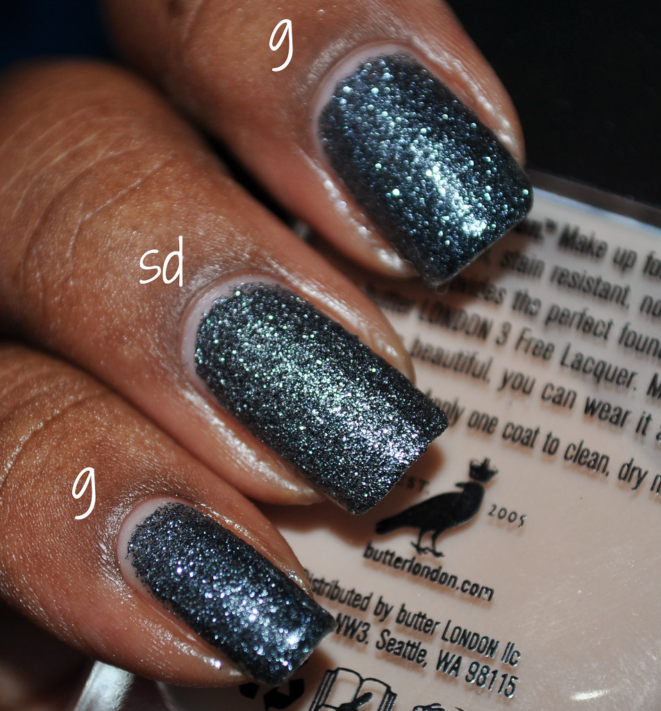
The only noticeable difference between the two is that the teal glitter in the HC is more vibrant than the DL. The DL also has a blue-ish base, while the HC has a clear base. Over black, the difference is still slightly noticeable.


These two are not dupes, but they will probably be close enough for most people, especially considering the price difference. I actually like Emerald's Eve more. The formulas are comparable - both thick and packed with glitter.


Hardy Candy Emerald's Eve (7.8 ml) retails for $4 and is available on Walmart.com. It's probably in-store too, but save yourself the headache and just order it online.


Deborah Lippmann Shake Your Money Maker (15 ml) retails for $19 and is available at Sephora and Ulta.
08 September 4 comments
If you haven't seen my review of Illamasqua Venous yet, check it out here.


green nail polish cremes comparison
Misa Dirty Sexy Money, Illamasqua Venous, Barielle Sweet Addiction


green nail polish creme comparison
2 coats of each

No dupes here! Misa Dirty Sexy Money is similar, but it's not as vibrant and has a touch more green than Illamasqua Venous. Barielle Sweet Addiction's difference are obvious.


I'd say they are different enough to own all three, but if I had to choose one, it would definitely be Illamasqua Venous.
28 April 6 comments
Illamasqua Superstition is a new shade that appears to be a Sephora exclusive. Harem, Superstition, and Venous are three new shades that popped up at Sephora recently, but I haven't been able to locate them elsewhere. They are not even available on Illamasqua's website.


2 coats, no topcoat

Illamasqua Superstition is a vibrant fuchsia creme. It probably has some neon pigment in it, which would explain the satin finish.


2 coats, with topcoat

I've really been drawn to colors like this lately. I'm finding I like the way cool pinks look on me now, even though I hated them in the past. Superstition's formula is quite nice; Illamasqua rarely fails in this department.


For the comparison, I chose to stick within the brand. Illamasqua Obsess came to mind when I initially swatched Superstition, and I threw Illamasqua Stance in as a reference point.


Illamasqua Stance, Superstition, Obsess


2 coats (tc), 2 coats (tc), 3 coats (no tc)

Pause. I totally forgot how much I love Stance. It's such a fabulous polish.


Anyway, Obsess has a touch more purple than Superstition. It's like someone put a few drops of Stance into a bottle of Superstition. I think they're different enough to own both, but I'm also insane, so take that with a grain of salt. For what it's worth, SO couldn't tell the difference between Obsess and Superstition.


Illamasqua Superstition retails for $14 and is available at Sephora.
21 March 7 comments

Into the arena for this battle:


Barielle Elle's Spell, Layla Ceramic Effect 53, Deborah Lippmann Raspberry Beret


4 coats Elle's Spelle, 3 coats 53, 2 coats Raspberry Beret


While none of these are dupes, they are more similar than I expected. I love all of them for different reasons. Elle's Spell is magical layered over pretty much everything. Raspberry Beret and 53 are gorgeous on their own.


No casualties this time around. They're all too different and pretty to get rid of any of them.


I haven't made huge strides in purging my stash yet, but keep the faith. I'm sure things will pick up.

10 January 3 comments
I thought I'd start off the year with a Purge Wars post, since my one and only New Year's resolution is to take purging my stash more seriously. Hopefully it sticks because I'm running out of storage space!


Today, I've pitted different flakies with colored bases against each other. I also wanted to see if I could franken-layer to achieve a similar look.


First into the arena were Layla Ceramic Effect 52 and Nfu.Oh 51


Layla Ceramic Effect 52, Nfu.Oh 51


5 coats 51, 3 coats 52

The base colors of 51 and 52 are more similar than I anticipated. The biggest difference would be the opacity. I'd probably choose 52 to wear alone more often than 51 because I don't often have time for a 5 coat mani. I had no trouble applying either of these.


I used American Apparel African Violet as a base, and then layered Essie Shine of the Times and Milani Purple Neon for my franken layer. The purples I chose were too warm, and the flakie was too dense, but I do think it's possible to get close to 51 or 52 with a few corrections and maybe a coat of 230 or something similar. I think my next attempt will be more successful.


Battle Casualty: I'm keeping both of these because...just look at the pretty! Look at it!


Next up are Urban Outfitters Mystic and Deborah Lippmann Ray of Light


Urban Outfitters Mystic, Deborah Lippmann Ray of Light


3 coats Mystic, 3 coats Ray of Light

Mystic has larger flakes and its base more vibrant than Ray of Light. Mystic also looks a touch darker than Ray of Light, which is probably because it lacks that slightly dusty quality that Ray of Light has. The formula on both was a bit thick, so I thinned them both. No problems after than.


My franken-layer is a Revlon Royal base with Sally Hansen Hidden Treasure and American Apparel Moonlight Beach layered. I think Hidden Treasure was a better choice than Shine of the Times because it's less dense. I think I'd go for a darker jelly to achieve a more accurate look. Maybe Deborah Lippmann Rehab.


Battle casualty: Urban Outfitters Mystic. There's something missing here. Maybe some depth? Not sure, but I don't mind parting with it.


Is it bad that I prefer my franken layers over all of them, though? Maybe I'm just stroking me ego. :)


That's it for this round of Purge Wars. Stayed tuned for Battle of the Flakies 2:


They're more similar than you think


06 January 3 comments
Butter London has holos! As in holo that actually shows up without squinting (I'm looking at you AHtQ). Their Autumn/Winter 2012 collection includes Dodgy Barnett, a typical silver holo and Trustafrian, a light green holo.


3 coats, sunlight


flash

Butter London Dodgy Barnett is a silver grey holo. I would call this subtly linear/borderline scattered as I never really saw a distinct flame while in the sun. In terms of strength, I would put this slightly above Color Club's current, non-dud holos (not the Halo Hues!). Indoors, Dodgy Barnett looks like a shimmery light grey. It doesn't fall flat like some of the stronger holos.


The formula is pretty good. Nice consistency, but I experienced a bit of cuticle drag. I dealt with this by just waiting a moment longer in between coats. Dodgy Barnett dried fairly quickly with a nice shine.


I managed to find a dead on dupe for Dodgy Barnett, but it's unfortunately not that easy to obtain.


2 coats China Glaze OMG, 3 coats Butter London Dodgy Barnett, 3 coats Catherine Arley 676

China Glaze OMG is there simply for reference. I wanted to show how much grey Dodgy Barnett has compared to a silver holo. Catherine Arley 676 is the same as Dodgy Barnett in terms of holo strength, opacity, and color.


This comparison probably won't be useful unless you already own 676. If you don't and really like Dodgy Barnett, I would advise you to go ahead and get it. Ordering Catherine Arleys is not very cost efficient unless you want several of them.


Butter London Dodgy Barnett retails for $14 and is available at butterlondon.com and Ulta.


08 August 5 comments
I saw a swatch of Butter London Gobsmacked in last month's issue of InStyle and knew it had to be mine. My weeks of lusting did not go in vain. Gobsmacked is a stunner!


3 coats


with flash

Butter London Gobsmacked is a deep charcoal grey glitter. It has a ton of depth - totally reminds me of asphalt. Gobsmacked dries matte with some texture. These pictures were taken with no topcoat but before the polish was completely dry. It was smooth and quite shiny with one coat of Seche Vite.


The formula is typical of dense microglitters: a bit thick but manageable if you use thin coats and wait a minute before applying the next coat. I've also found that adding a few drops of thinner usually takes care of the problem, but that was unnecessary with Gobsmacked. Also, Gobsmacked dried quite quickly.


Moving onto the comparison, the closest polish I found in my stash to compare is Milani Silver Dazzle.


3 coats Butter London Gobsmacked (g), 2 coats Milani Silver Dazzle (sd)


with flash

Silver Dazzle and Gobsmacked are not dupes.The key difference is Silver Dazzle's warmer, lighter color. Gobsmacked almost looks blue in comparison. Silver Dazzle is also more textured.  I had to use two coats of Seche Vite to smooth it out. Above, they are shown without topcoat.


While I don't consider these dupes (they look obviously different, even at arm's length), Silver Dazzle may be close enough for some. The price point of the Milani is definitely more desirable, but I think it will just come down to personal preference. I think I'll keep both for now.


Which do you prefer?


Milani Silver Dazzle retails for $5 and is available at most drugstores.

Butter London Gobsmacked retails for $14 and is available at butterlondon.com.
06 August 9 comments
While shopping Butter London's Autumn/Winter 2012 collection, I had a feeling I'd seen Lovely Jubbly before. I couldn't make the connection, so I bought it anyway. Of course, it clicked as soon as I got home:


Sally Hansen Rockstar Pink, Butter London Lovely Jubbly


2 coats Rockstar Pink, 3 coats Lovely Jubbly

I'm usually super nitpicky about what I call a dupe, and I have no problem calling Sally Hansen Rockstar Pink a dupe for Butter London Lovely Jubbly. Or is it the other way around since Lovely Jubbly is newer? The only difference is that Rockstar Pink is slightly more dense than Lovely Jubbly. There is really no need to own both of these, though.


1 coat Sally Hansen Rockstar Pink, 1 coat Butter London Lovely Jubbly over 2 coats  Nails Inc. Baker Street

I wanted to try to show the slight difference in the opacity of these glitters. I do prefer the look of Lovely Jubbly layered, but again, it would be ridiculous to suggest owning both of these.


The formulas we comparable. I had no issues applying either one, and the consistencies were not too thick or thin. I prefer the SHXW brushes to Butter London's.


I would suggest skipping Lovely Jubbly (unless you collect BL) and going for the much more cost efficient Rockstar Pink.
03 August 22 comments
This week's battle features three mid-tone purple cremes. Surprisingly, I don't own a lot of these. The more examine my stash, the more I'm learning about what colors interest me. So far, coral is hands down the winner. What color dominates your stash?


Anyway, into the arena:


American Apparel African Violet, Barielle Grape Escape, OPI


Disclaimer: Purples are always a challenge to photograph, but I tried to
get the most color accurate photos (to my eye and monitor) that I could. I sacrificed focus for color, so sorry for any
blurriness you see.


2 coats

American Apparel African Violet has more of a red undertone than I expected. I think slightly warmer purples look better on me than the cool ones.


I thought African Violet would be on the thick and a one-coater like most of my AA's. However, its consistency is thinner and a bit tough to control on the nail. I was prepared for it on the second coat, though, and it was totally manageable.


2 coats

Barielle Grape Escape is just a touch cooler than African Violet, but it is almost negligible. They are pretty much dupes. The formula on this is quite similar to African Violet's formula as well.


3 coats

OPI Funky Dunkey is much cooler than both African Violet and Grape Escape. The formula is also superb compared to the other two. It practically applied itself, which is something that almost never happens with OPIs. Pleasant surprise.


3 coats of each

Battle casualty: Barielle Grape Escape. Another Barielle bites the dust!


I chose African Violet over Grape escape because I like the bottle and the brush better. Funky Dunkey's wonderful formula and cool undertone saved it from the purge pile.


Which polish(es) would you have purged?


Have a wonderful weekend!
01 June 15 comments
I chose the first three polishes that popped into my head to compare with Chanel June. My mind definitely cries dupe way more often than necessary (i.e. it's usually wrong).


Deborah Lippmann P.Y.T., Chanel June, China Glaze Peachy Keen, Barielle Blossom


It was obvious from the bottles that two were definite outliers, but I stayed the course anyway.


The swatches are shown in the same order as the bottles, 3 coats each

As far as comparisons...


-P.Y.T. is far too pink but has the same squishy creme finish as June.

-Peachy Keen is the most similar of the bunch, but it is brighter and has a true creme finish. Note to self: I bet a coat of PYT over Pechy Keen could achieve a near-June result.

-Blossom is not at all similar, but super pretty, and I must remember to wear it soon.


With the slew of dupes coming out from cheaper polish brands (oh hey Revlon), I would imagine that a color as popular as June may have a dupe sometime in the future. The only question is, are you willing to wait?


If any polishes come to mind that you'd like compared with June, let me know. If I have it, I'll compare it.
25 April 9 comments
When I heard Fashion Bug had a dupe to OPI's coveted Mad as a Hatter, I scurried to their site to order a bottle. I'm not sure why hearing about a dupe makes me want it even more, but it really is fiscally irresponsible. On the bright side, now I can compare the two.


Multi Red, Mad as a Hatter


As you can see, they are not dead on dupes, but they are similar. Multi Red has more red, and the glitter looks slightly bigger than MaaH. From a distance, though, the difference is trivial. So, if you missed out on MaaH, perhaps Multi Red will satisfy your lemming.


22 March 5 comments
I did a quick comparison of TDI and FB because they seemed similar in my head. I don't typically like dupes because I feel dumb for wasting money that could've been used on a unique color. Occasionally, though, I like a color so much that I don't mind having a dupe as a backup. Anyway, they're not dupes. FB's duochrome shimmer is much more obvious and than TDI. I don't prefer one over the other, and they're definitely different enough to own both.


03 November 3 comments
Older Posts

About me

As a kid, while everyone else was collecting Pokemon cards, I was collecting Bonne Bell Lip Smackers. My addiction to lip balm evolved into an addiction to all things beauty – from makeup to hair to nail polish.

Follow Me

Labels

A-England American Apparel Anastasia Beverly Hills Avon Awards BareMinerals Barielle BB Couture Beauty Envy Bag Benefit Butter London Catherine Arley Chanel China Glaze Ciate CND Color Club Comparisons Deborah Lippmann Depend Dior Dolce & Gabbana Dr.'s Remedy Essence Essie Fashion Bug Finger Paints Formula X for Sephora Franken Gap Giveaway Givenchy Gosh Great Lakes Lacquer Guerlain Hard Candy Hauls Hello Kitty Hourglass Illamasqua ILNP Indie Nail Polish L'Occitane Lancome Layla MAC Marc Jacobs Mascara Milan Milani Misa Models Own MUFE Nails Inc. NARS Nfu.Oh Nicole by OPI Nina Ultra Pro Nubar OPI Orly Ozotic Pro Paul+Joe Polish Pickup Pop Beauty Pure Ice Purge Wars Rescue Beauty Lounge Reviews Revlon Rock + Republic Sales Sally Hansen Sandwich Saturday Sephora Sephora by OPI Shimmer Polish Sinful Sinful Colors SpaRitual Stash Studio M Swatches Tarina Tarantino Too Faced Ulta Pro Urban Decay Verity Wet n' Wild Wildflower Lacquer YSL Zoya

recent posts

Blog Archive

  • ▼  2021 (1)
    • ▼  January (1)
      • Ethereal Lacquer In the Name of the Moon Swatches ...
  • ►  2020 (6)
    • ►  December (2)
    • ►  November (2)
    • ►  October (2)
  • ►  2014 (20)
    • ►  November (1)
    • ►  October (5)
    • ►  September (2)
    • ►  August (1)
    • ►  April (2)
    • ►  March (3)
    • ►  February (3)
    • ►  January (3)
  • ►  2013 (96)
    • ►  December (1)
    • ►  November (21)
    • ►  October (25)
    • ►  September (7)
    • ►  August (5)
    • ►  July (1)
    • ►  June (8)
    • ►  May (6)
    • ►  April (8)
    • ►  March (6)
    • ►  February (3)
    • ►  January (5)
  • ►  2012 (80)
    • ►  December (3)
    • ►  October (5)
    • ►  September (9)
    • ►  August (9)
    • ►  July (9)
    • ►  June (14)
    • ►  May (13)
    • ►  April (17)
    • ►  January (1)
  • ►  2011 (65)
    • ►  December (3)
    • ►  August (3)
    • ►  July (4)
    • ►  May (6)
    • ►  April (18)
    • ►  March (8)
    • ►  February (11)
    • ►  January (12)
  • ►  2010 (112)
    • ►  December (27)
    • ►  November (40)
    • ►  October (29)
    • ►  September (3)
    • ►  June (1)
    • ►  May (1)
    • ►  March (7)
    • ►  February (4)
  • ►  2009 (4)
    • ►  August (2)
    • ►  July (2)